SaaS, Productivity 
Optimizing Design and Code for anydone: Crafting a Responsive, Pixel-Perfect Web Experience
SaaS, Productivity
About the Project
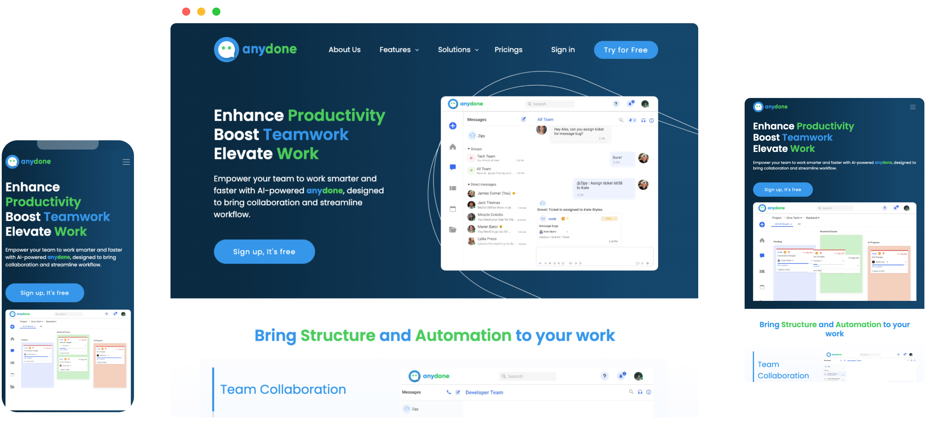
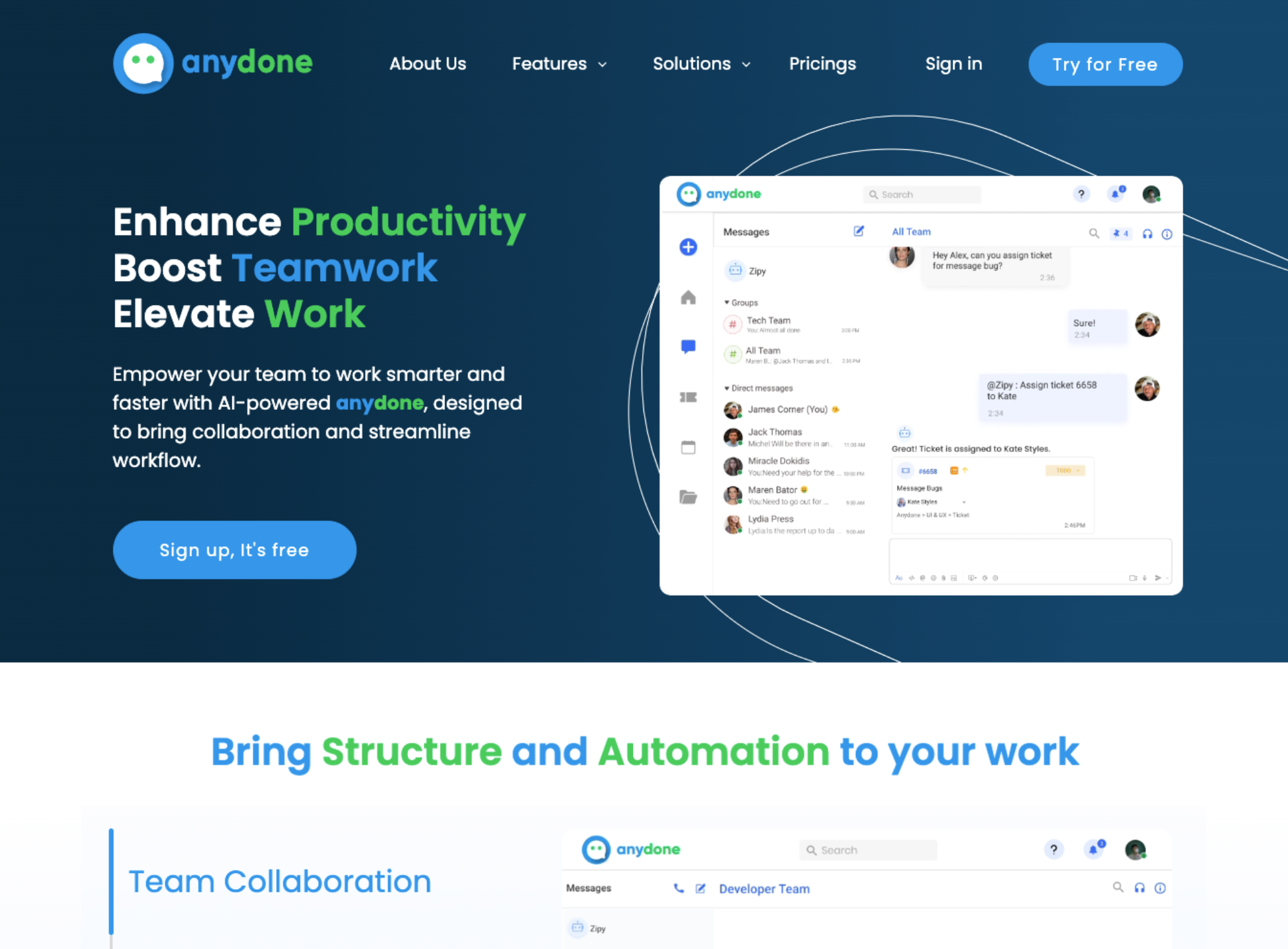
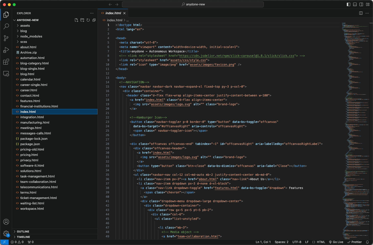
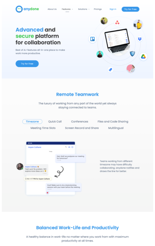
AnyDone is a productivity platform aiming to deliver seamless user experiences. The project focused on optimizing the platform's website design and code to ensure a responsive, pixel-perfect interface that enhances usability and visual appeal across devices.
View Website** Backup link represents site at time of this case study. The live site is now operated by the client.
Industry
SaaS, Productivity
Agency
Independent Contractor
Year
2023
Roles
High-Fidelity Wireframing
Responsive Design Implementation
Content Guidance
Developer Handoff
Pixel-Perfect Grids
Tools
Figma
Zeplin
HTML, CSS, JavaScript
GitHub
Trello
Illustrator
Photoshop
Slack
Trendy angled mockups of anydone but you are gonna learn all about this product in this case study!
01. Start
02. Research
I conducted competitive analysis to benchmark design trends in productivity platforms. I also reviewed user feedback and identified areas for improvement in responsiveness, content structure, and visual hierarchy.
I began by analyzing AnyDone’s objectives, ensuring alignment between the platform’s goals and its target audience's expectations. The focus was to create a responsive and professional interface that reinforced the brand identity.
A thorough competitor analysis helped identify industry standards and trends in productivity platform design. Insights were drawn from leading players in the market, highlighting best practices and areas where AnyDone could differentiate.
Collaborating with stakeholders, I identified AnyDone’s core user demographics: professionals and teams seeking productivity tools. This understanding shaped decisions around content positioning, visual hierarchy, and interaction design.
To inform the design, I gathered user feedback through:
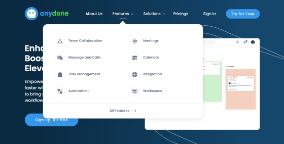
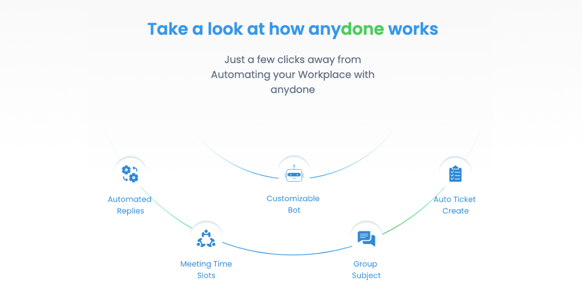
Users needed quick access to key tools, highlighting the importance of intuitive navigation and visible entry points.
Consistent performance across devices was a top priority, emphasizing the need for pixel-perfect, adaptable layouts.
Clear content structuring improved readability and engagement, catering to the productivity-focused audience.
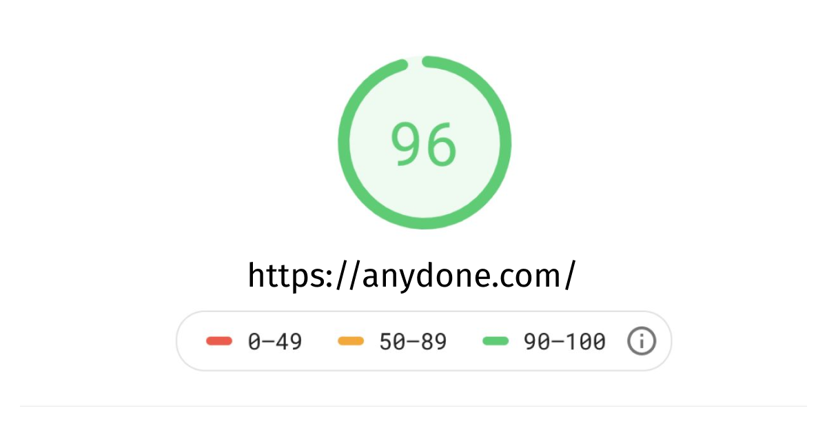
Faster load times and seamless transitions significantly impacted user satisfaction, making optimization essential.
03. Strategy & Planning
The sitemap process was pretty straightforward. I’ve started thinking of the home as the main container for almost all my features. Then I’ve defined the primary and secondary navigation.
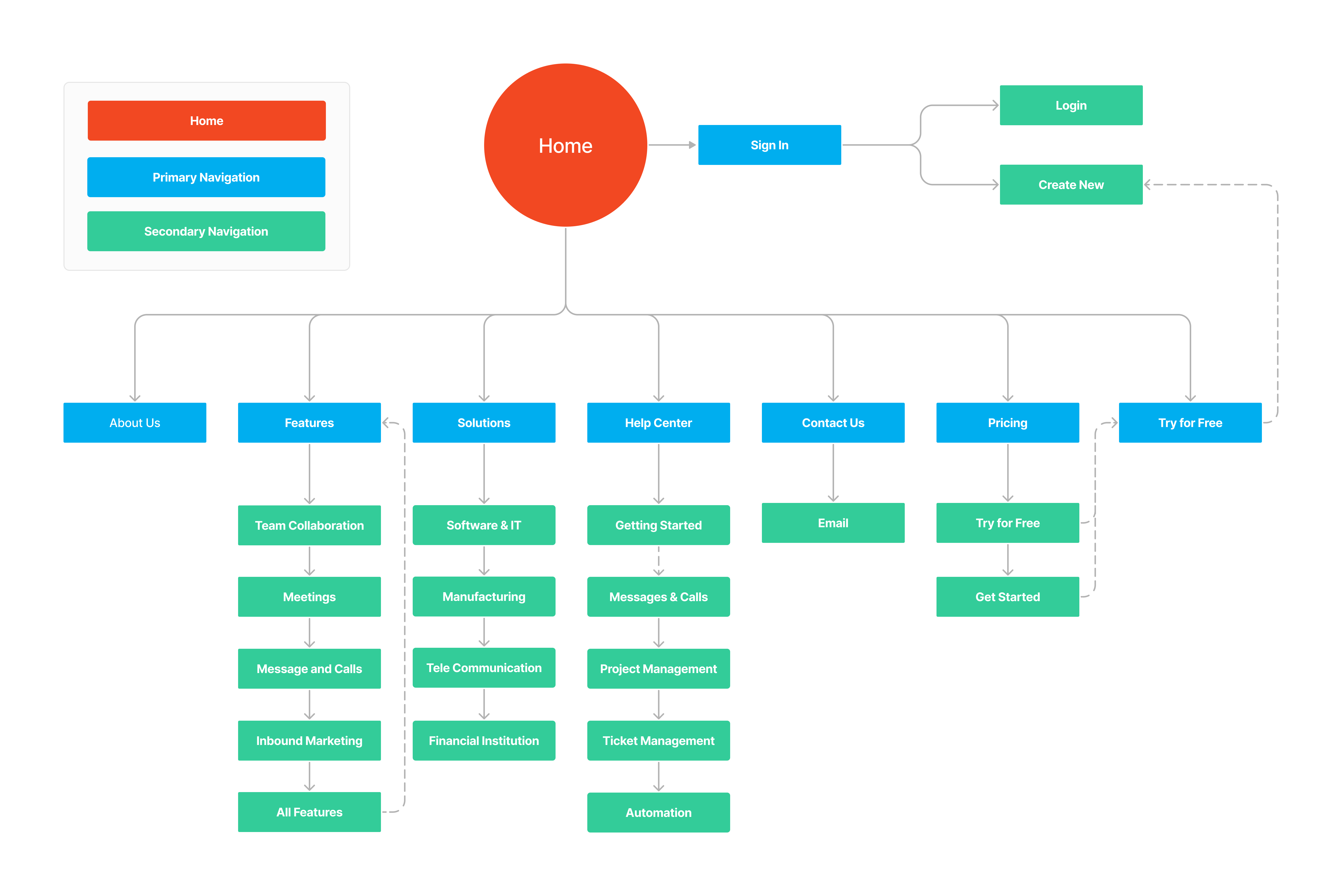
At this point, I’ve identified a task I’ve then tested during usability tests phase:
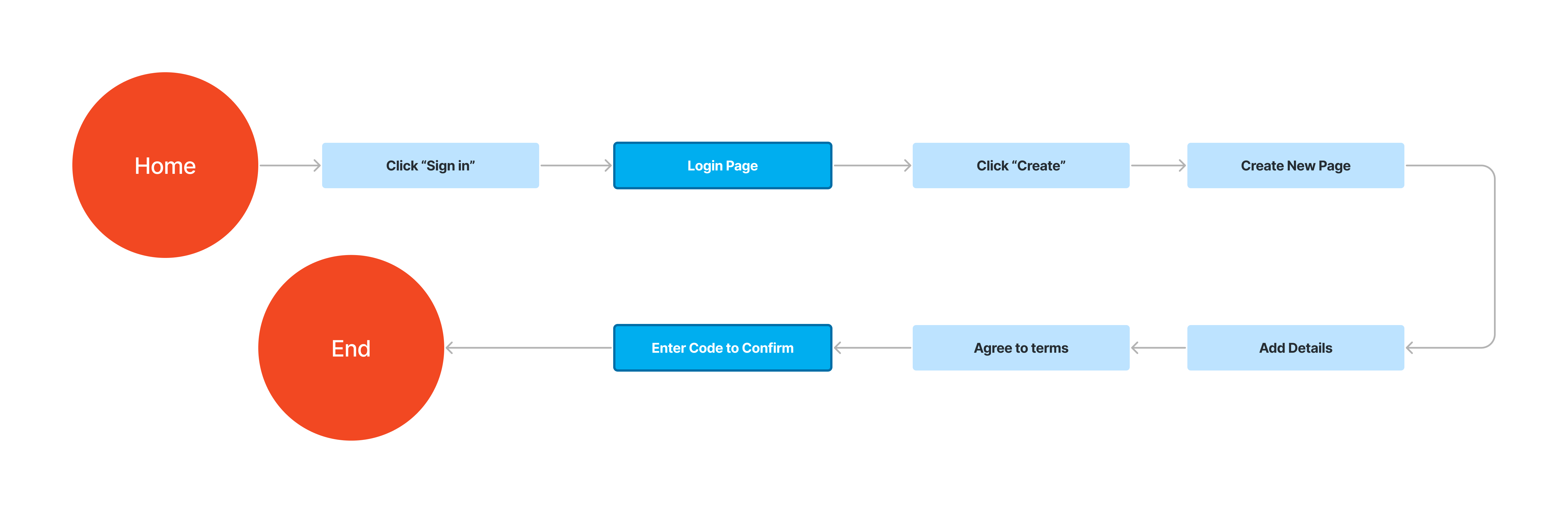
I designed the flow to guide users step-by-step, ensuring a smooth and intuitive experience.
04. Design & Development
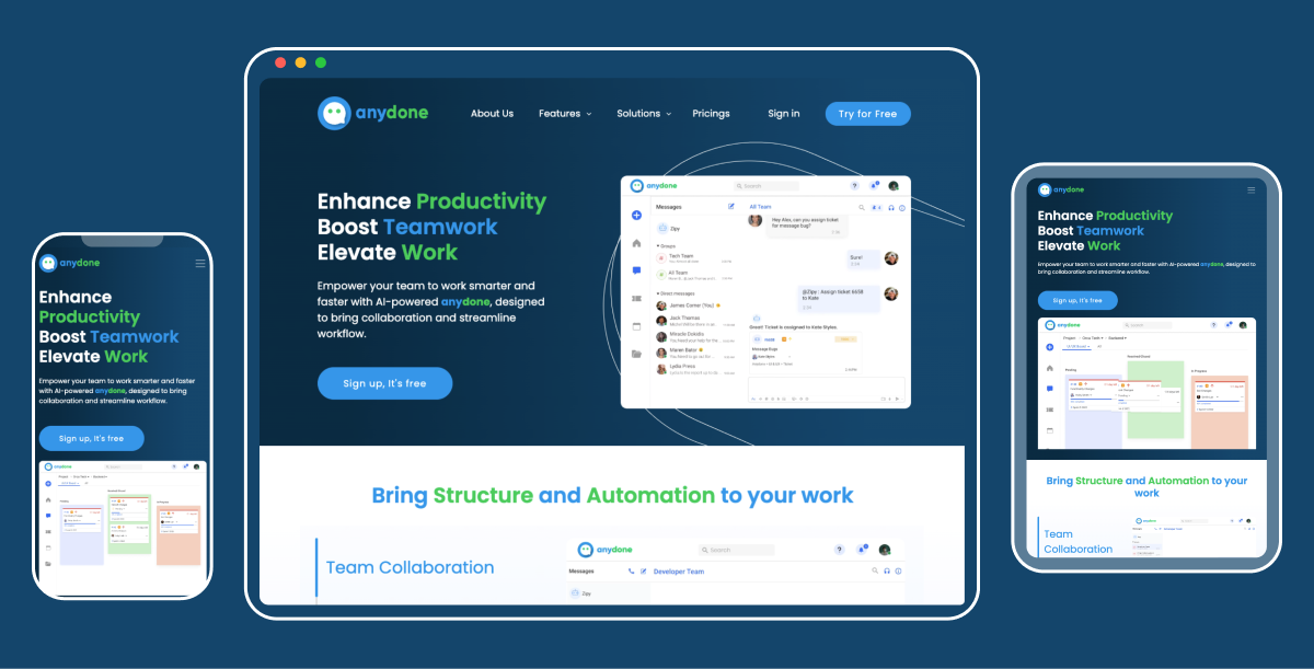
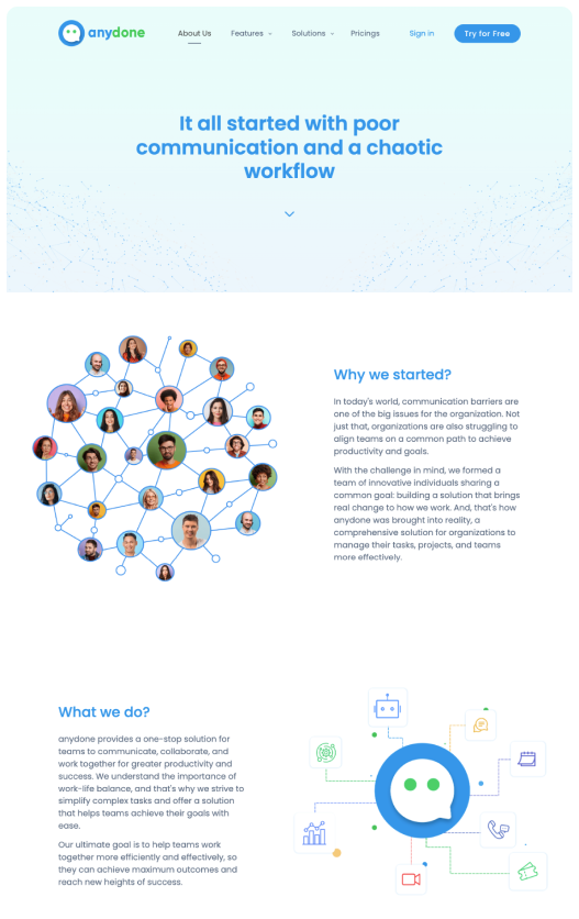
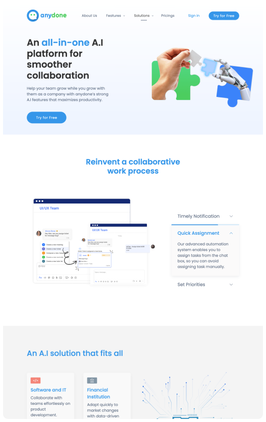
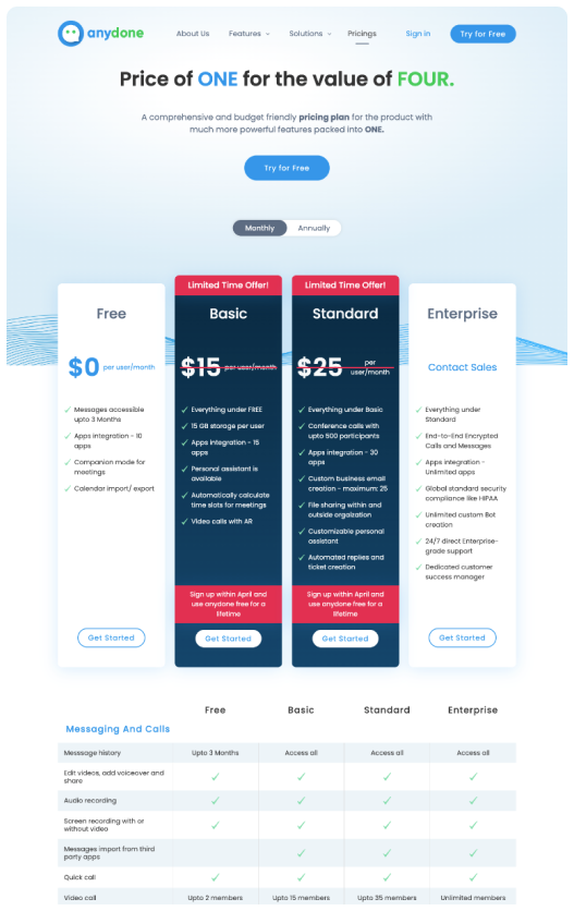
Analyzed the existing design to identify gaps, including the lack of responsiveness and grid structure. Developed a strategic plan to implement a 12-column Bootstrap grid system for a structured, responsive layout. Adapted the high-fidelity design in Figma, ensuring alignment with the new framework while preserving visual consistency.
Built responsive prototypes in Figma, demonstrating how the updated design would behave across devices. This step allowed stakeholders to review and provide feedback on the improved layouts.
Translated the designs into responsive code using HTML, CSS, and JavaScript within the Bootstrap framework, ensuring technical accuracy and seamless implementation.
Conducted cross-device and cross-browser testing to confirm the website’s responsiveness and consistency. Adjustments were made based on usability tests to deliver an optimal experience for all users.

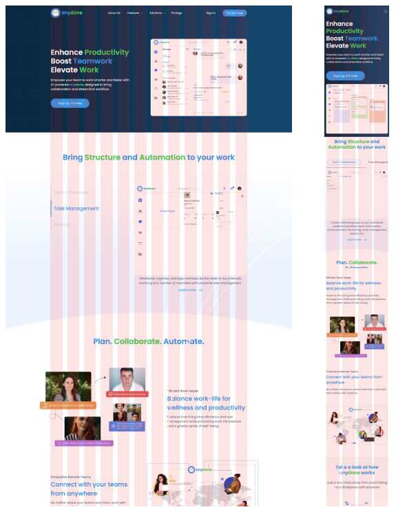
The visual design phase focused on ensuring a responsive and visually appealing interface. By adhering to a 12-column grid system, I optimized layouts for consistent alignment and scalability across all devices. The design maintained a clean aesthetic, balancing typography, colors, and visual hierarchy to create an engaging and user-friendly experience.
05. Conclusion
My journey through this project provided several key insights.
Leveraging a 12-column Bootstrap grid system ensures consistency and adaptability in responsive designs, enabling seamless experiences across devices.
Transforming existing high-fidelity designs into responsive layouts highlighted the need for flexibility and foresight in the initial design stages.
Effective communication and structured handoffs between design and development are essential for preserving design integrity during implementation.
Continuous testing and refinement are critical for identifying and resolving usability issues, ensuring a polished and functional end product.